Fundamentals of Acrylic Painting

INTRODUCTION TO COLOR

Understanding some basic Color principles and learning about color can be an exciting and lifelong adventure.  When you begin your first painting and begin learning the pigment names of the various colors, you will never “see” the world around you in the same way.  You will see the numerous colors in a sky, the different blues, pinks,  golds, purples and the cadmium yellows of light, medium and dark shades.  When you look at a tree, no longer will you think of it as green.  It will be many different shades of green, as well as yellows, blues, white and many shades of brown & gray.  How to create these colors becomes the exciting adventure! 

The Color Wheel Explanation

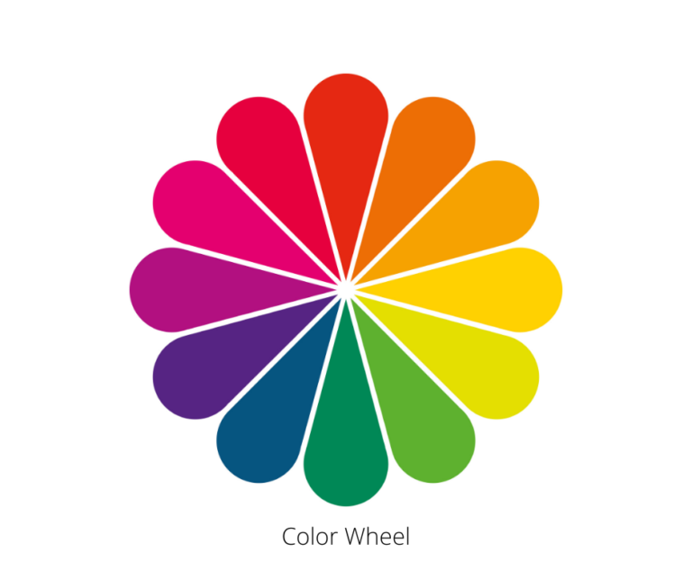
The Color Wheel is a circle depicting various colors in their relationship to one another and how they react with each other.  The colors are arranged in triangles by Primary, Secondary and Teriaries.  

     Primary – Red, Yellow, Blue (from which all other colors are made).

     Secondaries -Orange, Green, Violet (Made by mixing any 2 of the Primaries as, red + Yellow = Orange, Yellow + Blue = Green, Red + Blue = Violet

     Tertiaries – Red-Orange, Yellow-Orange, Yellow-Green,  Green-Blue, Blue-Violet, Red – Violet.  (Made by mixing a Primary & a Secondary).

By mixing these colors, we now have 12 new colors, but how do we mix 100’s of other colors?

Tints & Shades are 1 way.

     Tints have pure color added to WHITE. 

     Shades have BLACK added to pure color.

These tints & shades help us create help us create many other variations of color.  In fact, the colors we use in our daily life are more often than not, some of these Tints & Shades.

Complementary colors are another way.

Complementary colors are those which are directly opposite each other on the color wheel. (Red & Green, Yellow & Violet, Blue & Orange).  By mixing colors from these combinations, we are able to make 100’s more different variations.

So, now we have the ability to make 100’s, if not 1000’s of new colors, but how do we know how and when to use these colors?  The following characteristics will begin to show you what these various color mixes can do for your painting.

Temperature

Colors are considered either Warm or Cool.  All  of the Reds, Yellows, Oranges being WARM (think Fire & Sun).  The Blues, Greens, Violets are COOL (think grass, trees, water).  

In our Painting, this is IMPORTANT for several reasons:

     A,     Color can either Warm up or Cool down a painting.
     B.     Cool colors RECEDE, warm colors ADVANCE, creating a sense of depth & dimension
     C.     The use of some cool colors in an otherwise warm painting, and vice versa, can create a feeling of excitement and freshness, keeping it from looking “static”.

Value

The VALUE of a color is  it’s Lightness or Darkness, again important for several key reasons:

     A.     Strong Value Contrasts ( like Black against White for instance) demand attention while lower contrasts (Black vs gray or several shades of gray) draw less attention.
     B.     In our painting, Color Value knowledge helps you create distance and depth by selecting colors for the distance that are less contrasting and softer & grayer.
     C.     Stronger contrasts & brighter colors should be used in the foreground &/or focal area, to draw the viewers attention.

Complements Create Intensity

The understanding of Color Complements can be your BEST FRIEND in painting. In fact, to me, it’s almost the MOST important color concept that you can learn, for 2 main reasons:

(Complements are those colors directly opposite each other on the color wheel: Red/Green, Yellow/Violet, Blue/Orange)

     A.    When mixed together, color complements DULL & TONE each other down, to allow for easier modeling of  surfaces & shapes.  Be aware, however, taken further, these mixes can create “mud”.
     B.   When  Complements are placed side by side, they INTENSIFY each other.  This can create excitement & focus in a painting.  Taken to an extreme, this can cause a “clashing or jarring” effect.

Some Other Color Notes

  1.     Colors mix in 2 ways:  Physically (when mixing 2 or more colors, wet in wet and thereby creating a new  color).   Optically (One color over another or even in tiny strokes side by side, will appear to be mixed into a 3rd color by our brains & eyes).  This is why the Impressionism and Pointillism styles of painting, work.
  2.      To make a Color look lighterPlace it next to a darker value.  In painting an object, this translates into “placing your lightest, light, next to your darkest, dark.
  3.      To make a Color look brighter:  place it next to its Complement. 
  4.      To make a color look duller or less intense:  Place it next to an analogous color (colors next to each other on the Color Wheel).
  5.      To make a color come forward:  Make it warmer &/or lighter

Color Schemes

Traditional Color Schemes are combinations of colors that have been thought , by designers and artists, to be pleasing to the eye.  These schemes can be used in both artwork, in home decor as well as for apparel.

  1. Monochromatic: Shades, tints and tones of one color.
  2.  Triadic:  Any 3 colors, equidistant on the Color Wheel
  3. Analogous:  3 -4 colors side by side on Color Wheel
  4. Complementary:  Colors directly across from each other on the Color Wheel
  5. Split-Complementary:  A variation of the Complementary: 1 base color + the 2 colors adjacent to its complement
  6. Primary:  the 3 primary colors, Red/Yellow/Blue.

FORM

Shape versus Form

Basically, a shape is  2 dimensional, defined by an outline.    A form is shape that has the illusion of 3 dimensions by use of shading & highlights.   To create the look of highlight & shade, you must first determine the light source.  If painting from life, the source will be the sun, moon or artificial light.  If painting from your imagination,  you must decide where the light source is coming from.  Usually from approximately 10:00 or 2:00 and at an angle. This placement will give the most effective shadows to present the object most favorably.  It is necessary when painting, to be consistent with your light source and make sure it doesn’t change.

To create these forms, a sphere from a circle, a box from a square, a cylinder from a rectangle, and a pyramid from a triangle, there are 5 elements necessary.

  1.  Highlight:             This will be the brightest where the light strikes the object directly.  There should be 3-5 values of light, depending on the size of the object.
  2.  Shadow:                This will cover the rest of the object, again creating 3-5 values of Shadow.  To achieve these value changes, use the color’s complement.
  3.  Core Shadow:       This will be a crescent shape within the shadow area (part of the 3-5 values) on the side opposite from the highlight area and NEAR (not on) to the outside edge.  For this Core Shadow, use the complement of the body color in a very dark value.
  4. Reflected Light:     This is a Cool Light on the edge of the object, opposite the Highlight, that is cause by the light bouncing around the back of the object, and helps to give the object more form & volume.
  5. Cast Shadow:         This is ON the surface that the object is sitting on and is on the opposite side from the light source.  This can be on a flat surface or on another object, next to it.  The Cast Shadow is darkest up under the object and gets lighter as it goes out.  The shape is foreshortened and follows the shape of the object casting it.  Cast Shadow is transparent, so the surface shows thru and is best done in a complementary color to the surface.

COMPOSITION

All paintings & artwork  begin with a thought process.  Sometimes artists just start painting with a “feeling” but even that involves thoughts, about what colors, lines, tools to use.  The more complex the picture, the more thought goes into it.  A simple landscape or beach scene, requires establishing a horizon line, placement of other elements and what tools & brushes you’re going to use.  For the non-artist, this may seem like too much work.  All these “rules” about Color, Form, Composition are not really rules but just observations to get you started and to get you into the artist thought process sooner.

The good thing is, after you’ve painted a couple of “masterpieces”, following some of the guidelines, you’ll soon find that most of them will become 2nd nature.  The all you’ll use these for is to check yourself when something doesn’t look right to you.

  1. Decide on a Theme           Use your reference material (photos or from life)

        2. Use Good Design Principles:

  • Dominance:                    Utilize one Theme
  • Contrast:                         Variety of Shape, Colors, Values, Intensity & line
  • Rhythm & Repetition:    S’s & Z’s to create flow.          Don’t repeat identical shapes & sizes but do repeat colors in various areas throughout (at least 3).
  • Balance                         Creates  Stability          Creates Cohesiveness          Use of Asymetric  
  • Transition:                      Shades of color moving from 1 area to another        Use of a “Mother Color” (1 color  like 1 of the Earth colors) added to every other color                                               Overlapping of shapes & lines
  • Unity:                               Variety all throughout, all must work together to create a Total combination.

      3.  Decide on you Focal Point – Use the Rule of 1/3’s to find the best location.
           Rule of 1/3’s – this is used frequently by artists and photographers as a means of creating a pleasing compositional Focal Point.  A canvas or painting surface is                 divided horizontally & vertically into 1/3’s.  The junctions where the lines cross, are considered the Optimum choices for Focal Point placement.

     4.  Do several thumbnail sketches (small, quick “idea” sketches to work out design problems & /or color issues).

            Place Big shapes first
            Remember Composition of line (pleasing arrangement of subject matter)
            Center of Interest (avoid lines running off sides or corners
            Use overlapping shapes  to develop design

         5.  Establish true Verticals & Horizontals with a ruler.

           6.  Block in base colors on your thumbnail (check to see if it is balanced)

          7.  Emphasize the Focal Area by:
                   Contrasts & values,  color, light & dark area
                   Busy & Quiet areas
                   Vary Textures, Sizes & shapes
                   Define edges more sharply
                   Clarity & Intensity of color

            8.  Use the Element of Surprise – it keeps the interest of the viewer

             9.  Use of Framing:  This is using some element of your foreground design (rocks, trees, buildings,  even fabric) as a means of “stopping the eye” & focusing the viewer’s eyes toward the center of your canvas in the focal area. 

          10.  Decide on method of  design transfer:  (graphite paper -like carbon only non-smearing) or grid (where you transfer design square by square – 1″ x 1″ on design to 2-6″ x  2-6″ on painting surface)

Perspective

Perspective is a mathematical & geometric technique to produce a 3-Dimensional image  on a flat surface, that looks like that image in your direct vision.

Modern knowledge if perspective comes from the European artists of the 15th & 16th centuries.  It became the “science” of perspective, coming from constant observation & research which in turn created fundamental mathematical laws.  Architect, Filipppo Brunelleschi, painters, Macaccio & of course, Leonardo Da Vinci, all added greatly to this study.  Da Vinci even wrote a “Treatise on Painting” and at length about perspective.  So we can thank these “Renaisance men” for their  contributions to our current-day drawing & painting.

LINEAR Perspective

Perspective is the key to successful painting & drawing.  LINEAR Perspective is based on the fact that receding lines appear to converge at the horizon.  

In drawing or painting YOU (the artist) establish the Horizon line & Vanishing Points.  All vertical lines remain straight and parallel to each other

  1.      1 Point:          Everything converges to 1 Point (at eye level or horizon line.    You will see the face of an object + 1 partial side.
  2.        2 Point:         In this case, you are seeing the object obliquely  (the nearest corner) with lines extended to the sides with 2 different Vanishing Points
  3.         3 Point:        This depicts a building from 3 Vanishing Points (side to side and up or down).  This would be like looking up or down at a tall building.
perspective

In Still Life painting & drawing, the eye level line is the position of the viewer in relation to the objects in the picture.  think of a shelf with 2 or 3 objects on it.  The ELL doesn’t change but the view changes either up or down.  The Viewer would either see the shelf straight on, or see the top of the shelf & objects  or from underneath the shelf.

Clouds in the sky:  These are subject to perspective and the clouds will get smaller, flatter & closer together as they meet the Vanishing Point on the Horizon Line

landscape, water meadow, spill

Aerial or Atmospheric Perspective

Understanding this will help you create a sense of depth & dimension in Landscape & Seascape paintings.

Objects closest to us are clearer, brighter, warmer  and have the most detail.

Objects further away, have much less detail, are  drained of color & with  a somewhat bluish cast, colors are cooler in temperature.

Remember, Warm colors Advance, Cool colors recede.